

FRY - SMASH THE ORDINARY.
SERVICES PROVIDED
Brand Idea
Brand Rhetoric
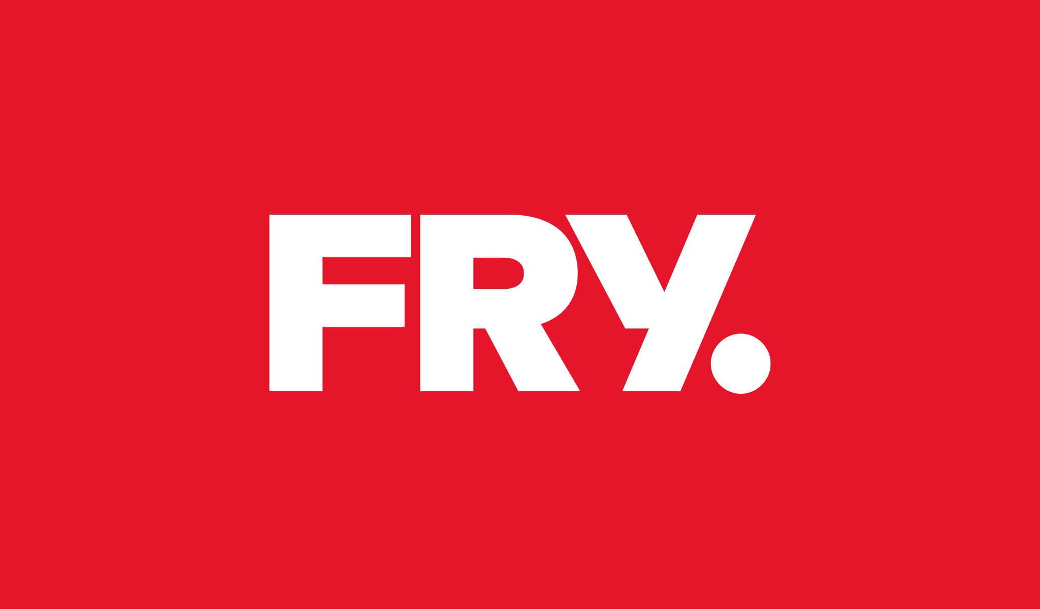
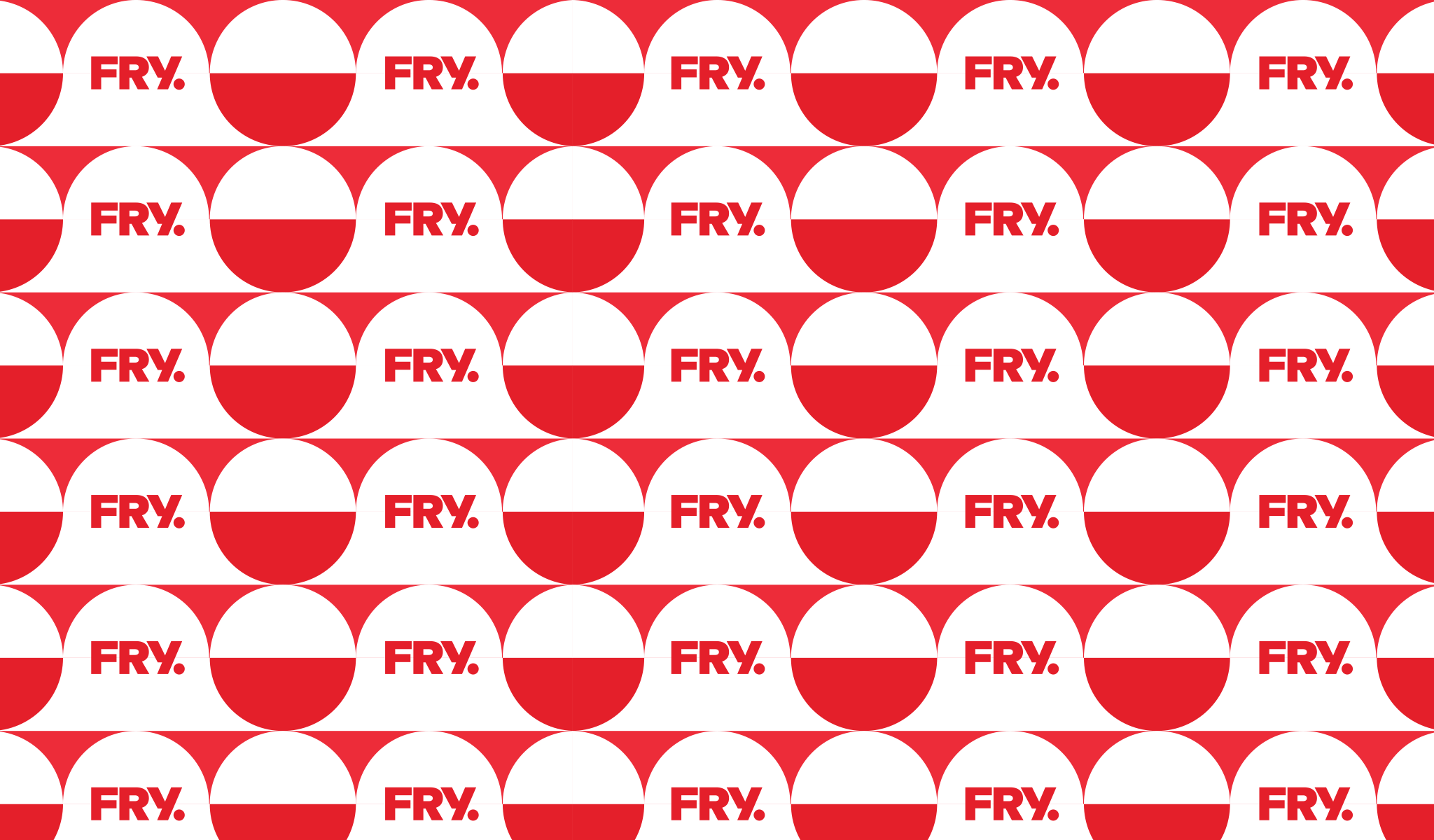
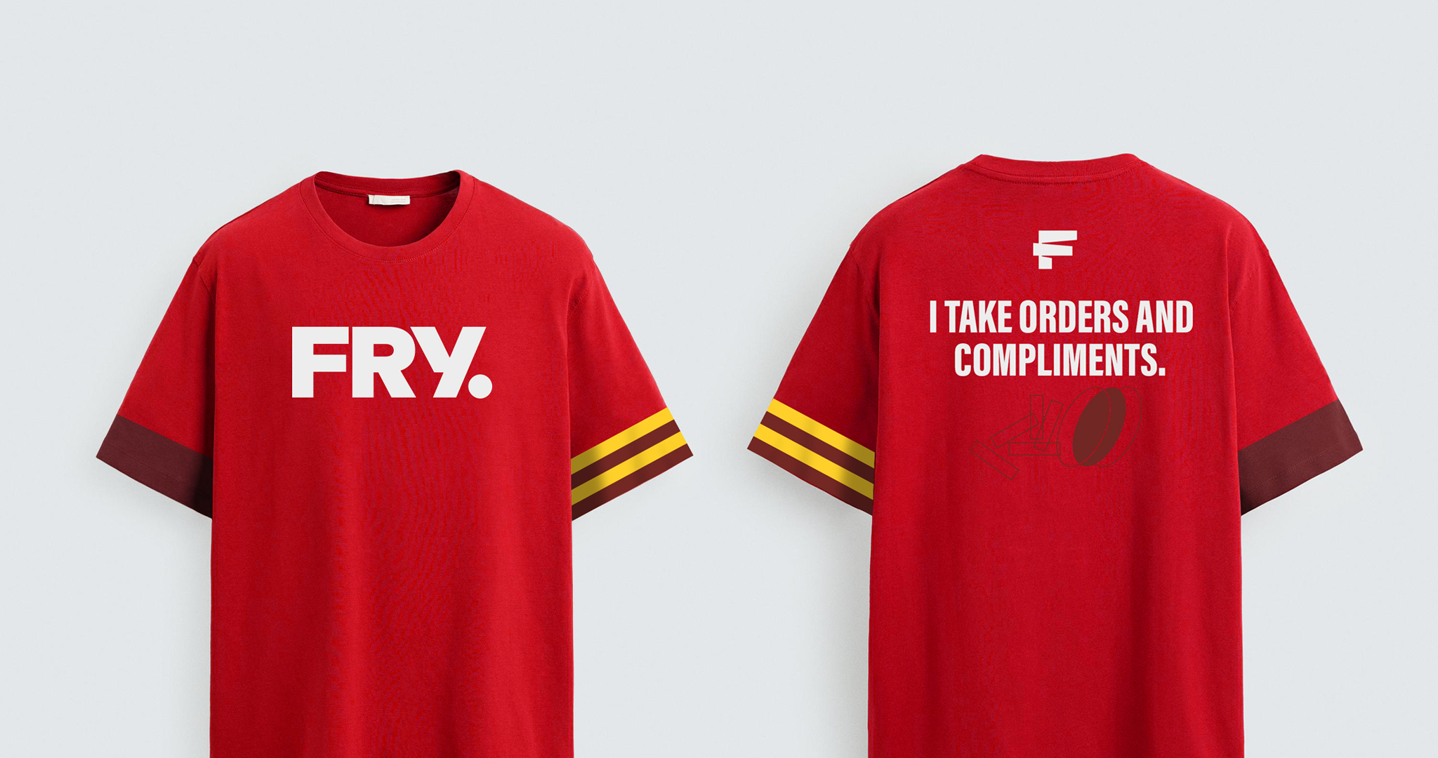
Logo Design
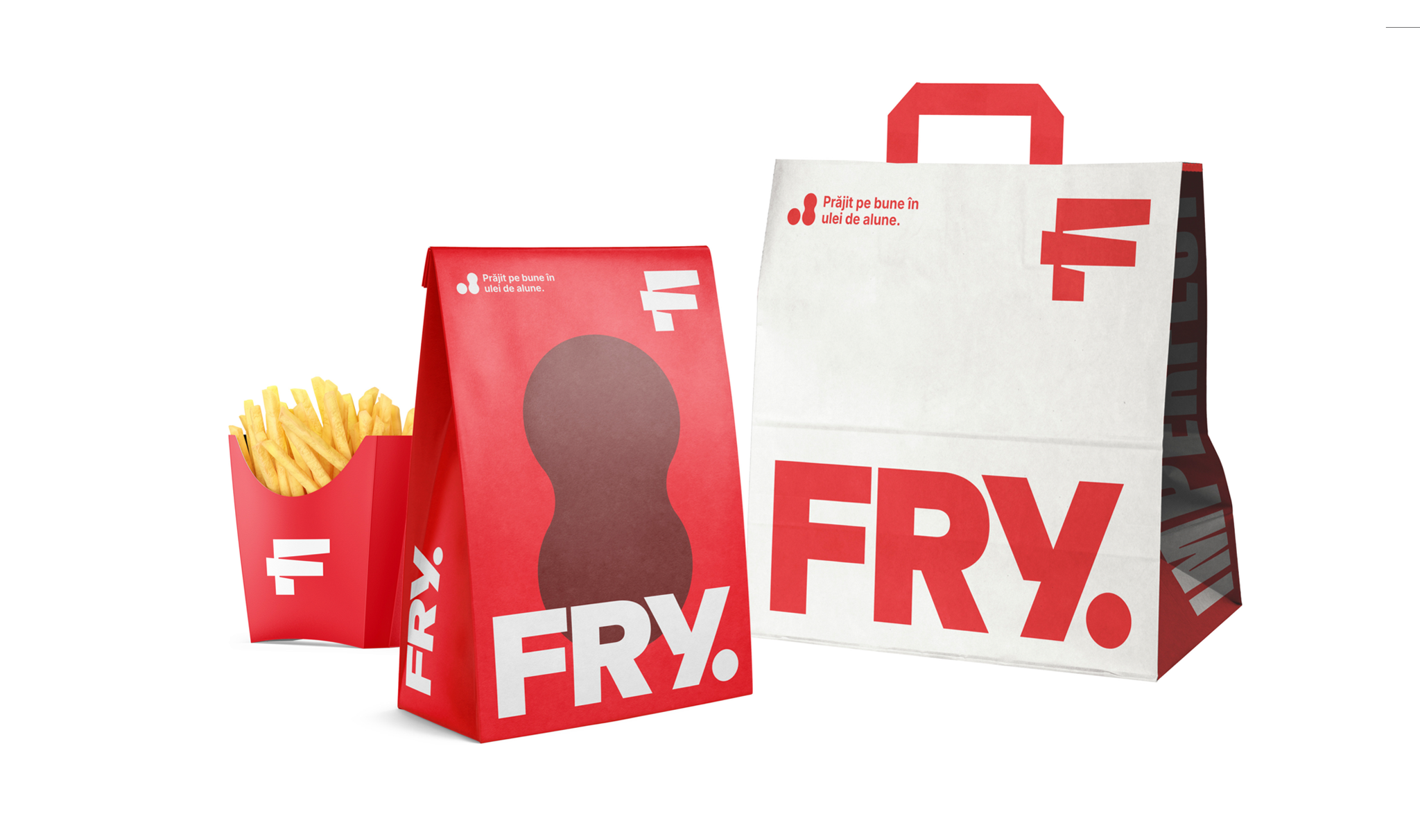
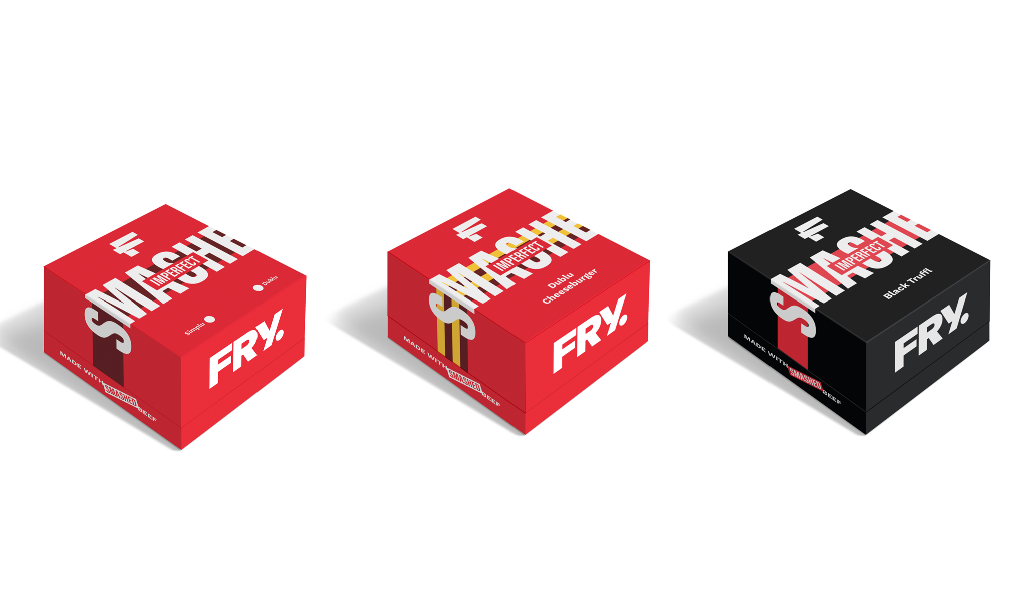
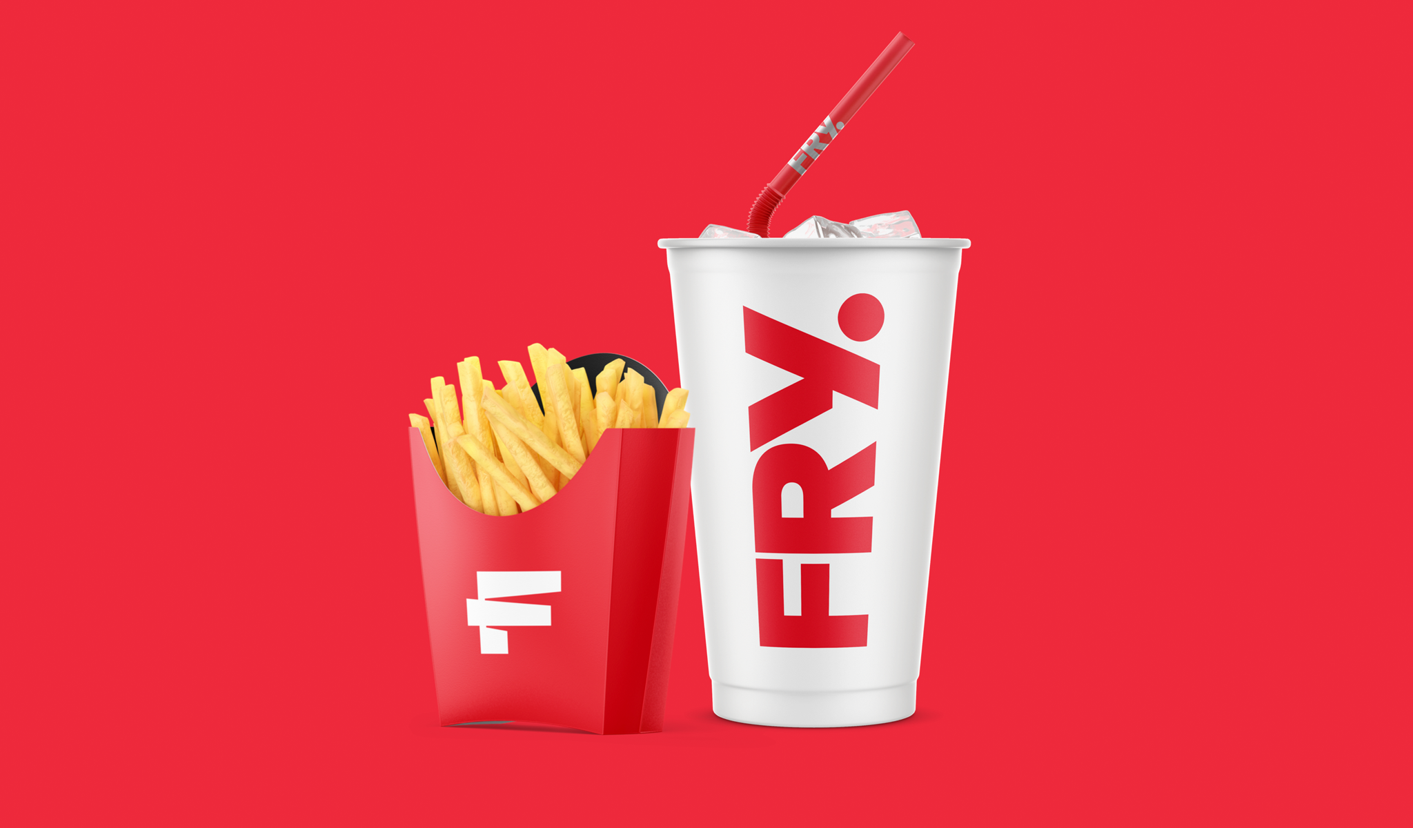
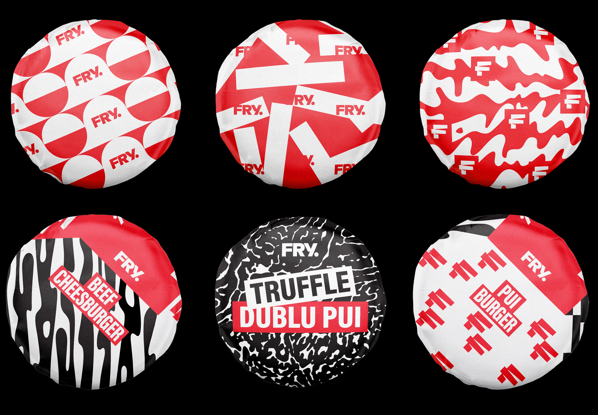
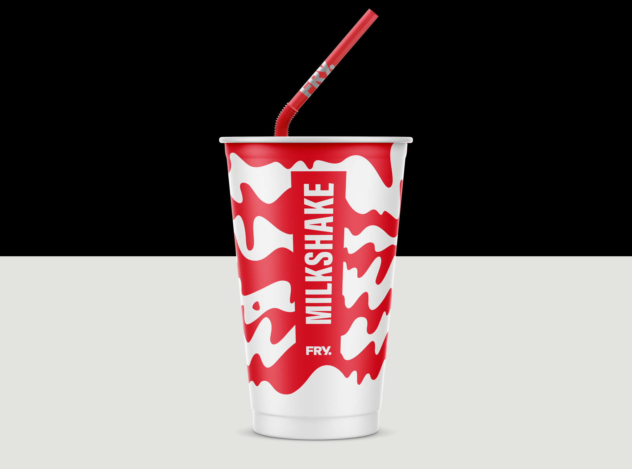
Packaging Design
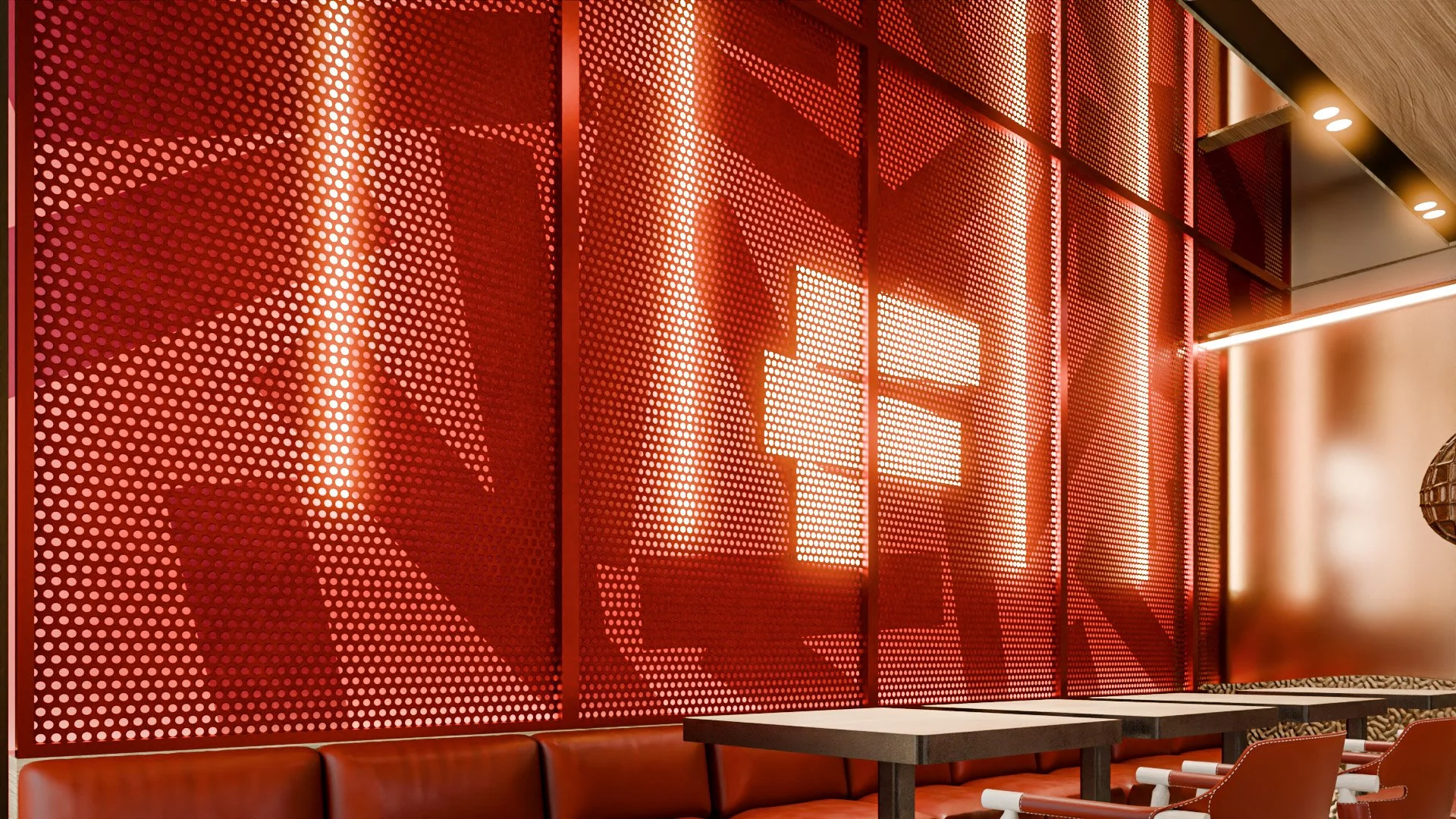
Signage
FRY came to us at a turning point.
The brand was simplifying its name from FRYDAY to FRY, and the identity needed to evolve accordingly—shorter name, stronger presence, clearer attitude.
Our mission was simple:
give the brand an edge.
More force. More coolness. More personality. Less noise.
The Idea
We started from what truly makes FRY different: fries cooked in their skin, in peanut oil.
That detail matters. It creates flavor, texture, and a story worth owning. So instead of inventing decorative elements, we built the identity around this core product truth.
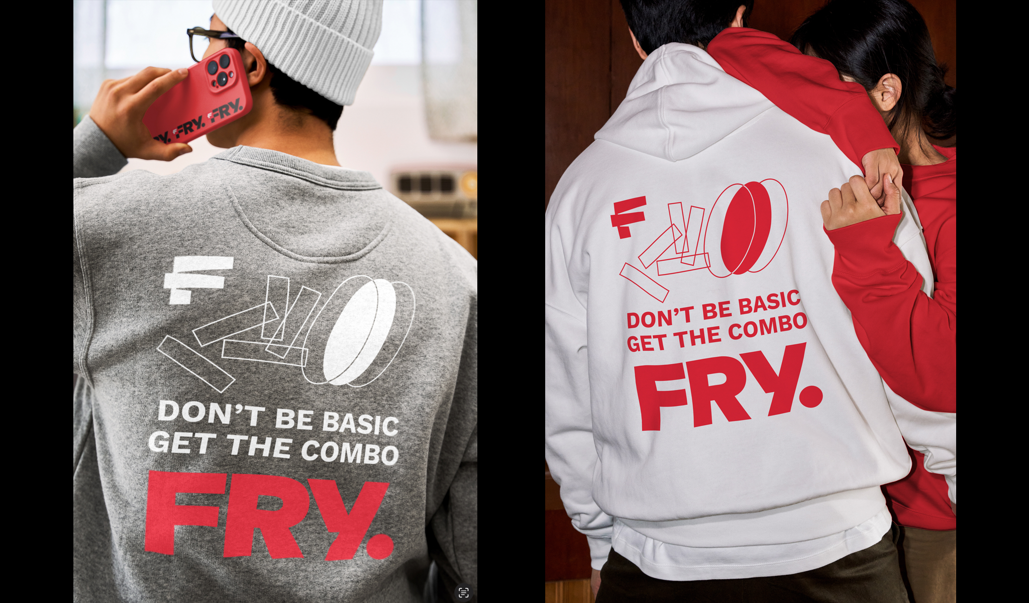
This led to the creation of a distinctive abstract symbol: a shape that reads as the letter F, but is constructed from the geometry of fries.
Designing attitude
The visual language was designed to feel bold, confident, and slightly rebellious—graphic compositions that feel energetic and unapologetic.
Packaging played a central role.
We simplified the burger box line, reducing visual noise and creating a unified system that works consistently across flavors and formats. This brought clarity, easier recognition, and a stronger brand block.
Patterns, wrappers, and secondary graphics extend the identity while keeping everything anchored in the same visual DNA.
Team
Marius Farcas
Adela Sabou
Beniamin Pop
Filip Cerchia