


PRIMEONE — BUILDING TRUST FROM DAY ONE
Services Provided
Brand Design
Logo Design & Visual Identity
Graphic Design
Webdesign
CONTEXT
PrimeOne is a fiber internet startup in the United States, entering a category where reliability is essential. Customers depend on their connection for work, entertainment and everyday communication. Choosing a provider means trusting a company to keep them connected.
For a new business, that confidence has to be earned from the first interaction.
THE CHALLENGE
The main challenge was to give a startup the credibility of an established brand.
PrimeOne needed to look ready to deliver: professional, consistent and dependable, with a clear identity that customers could recognize across every touchpoint.
Speed was part of the offer. Trust was the first requirement.
The branding had to support both—communicating the ambition of a new fiber provider while giving people confidence in the company behind the service.
THE SOLUTION
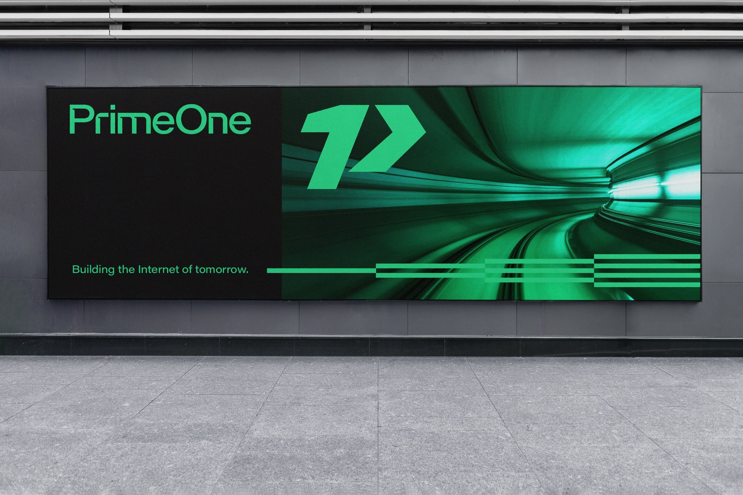
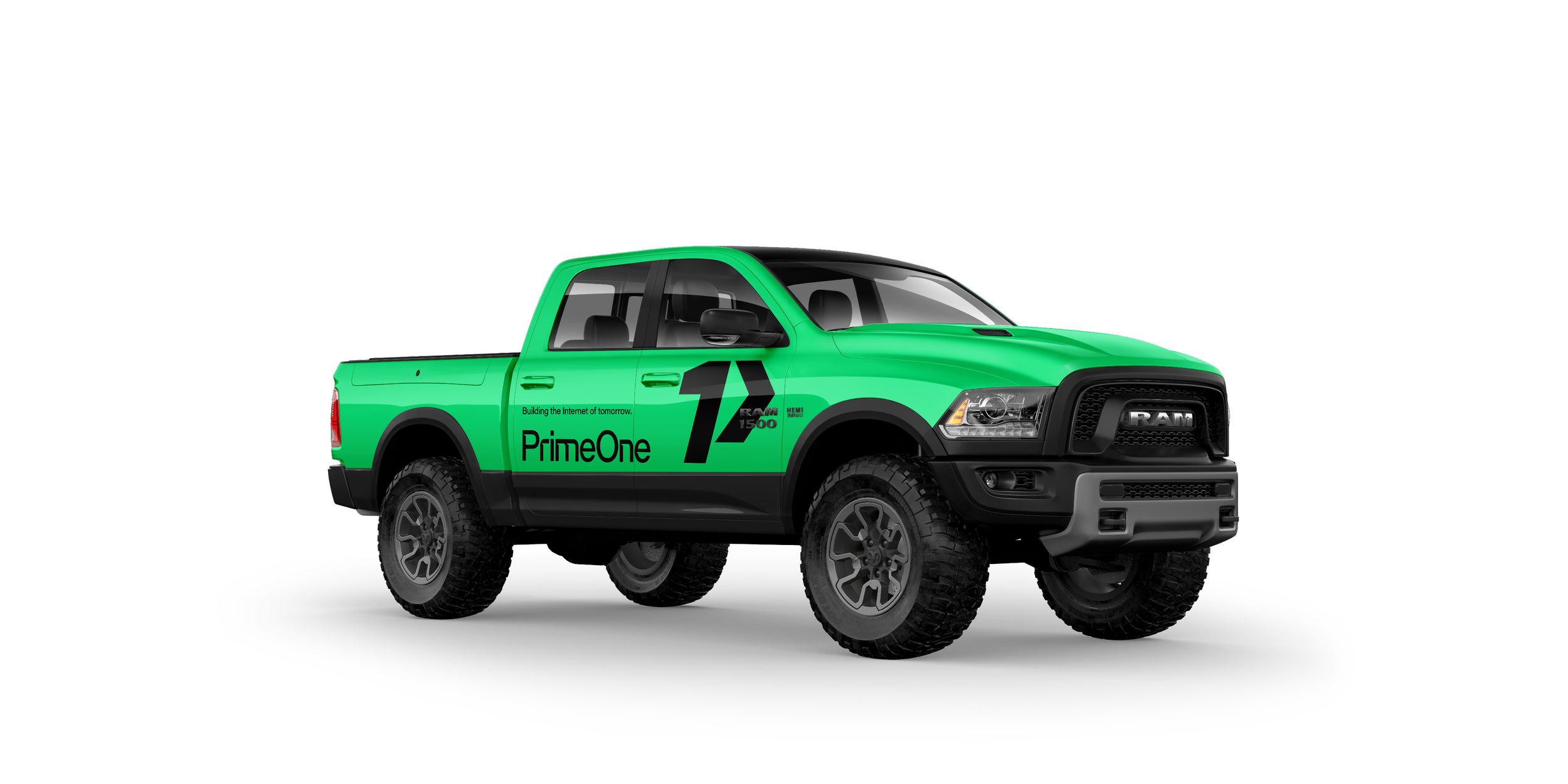
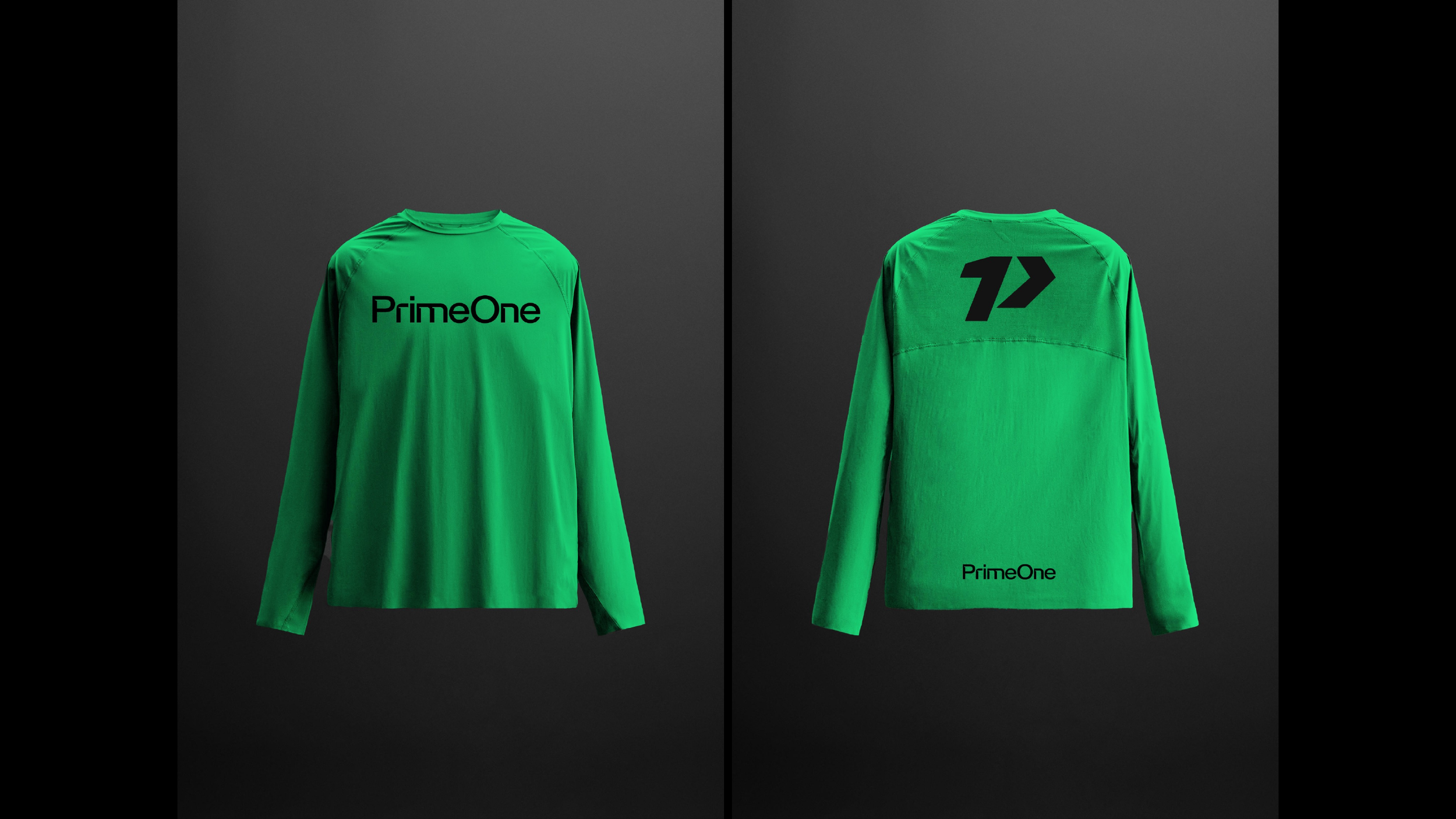
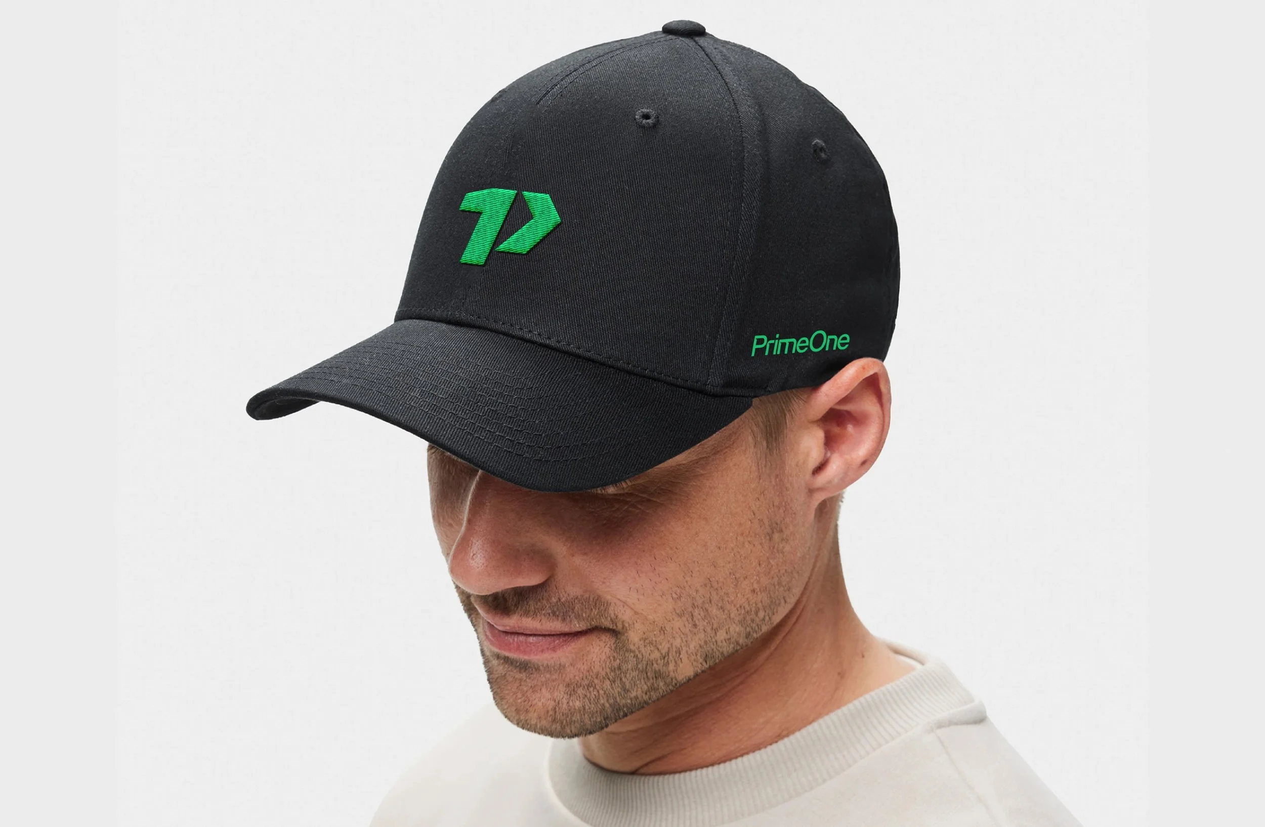
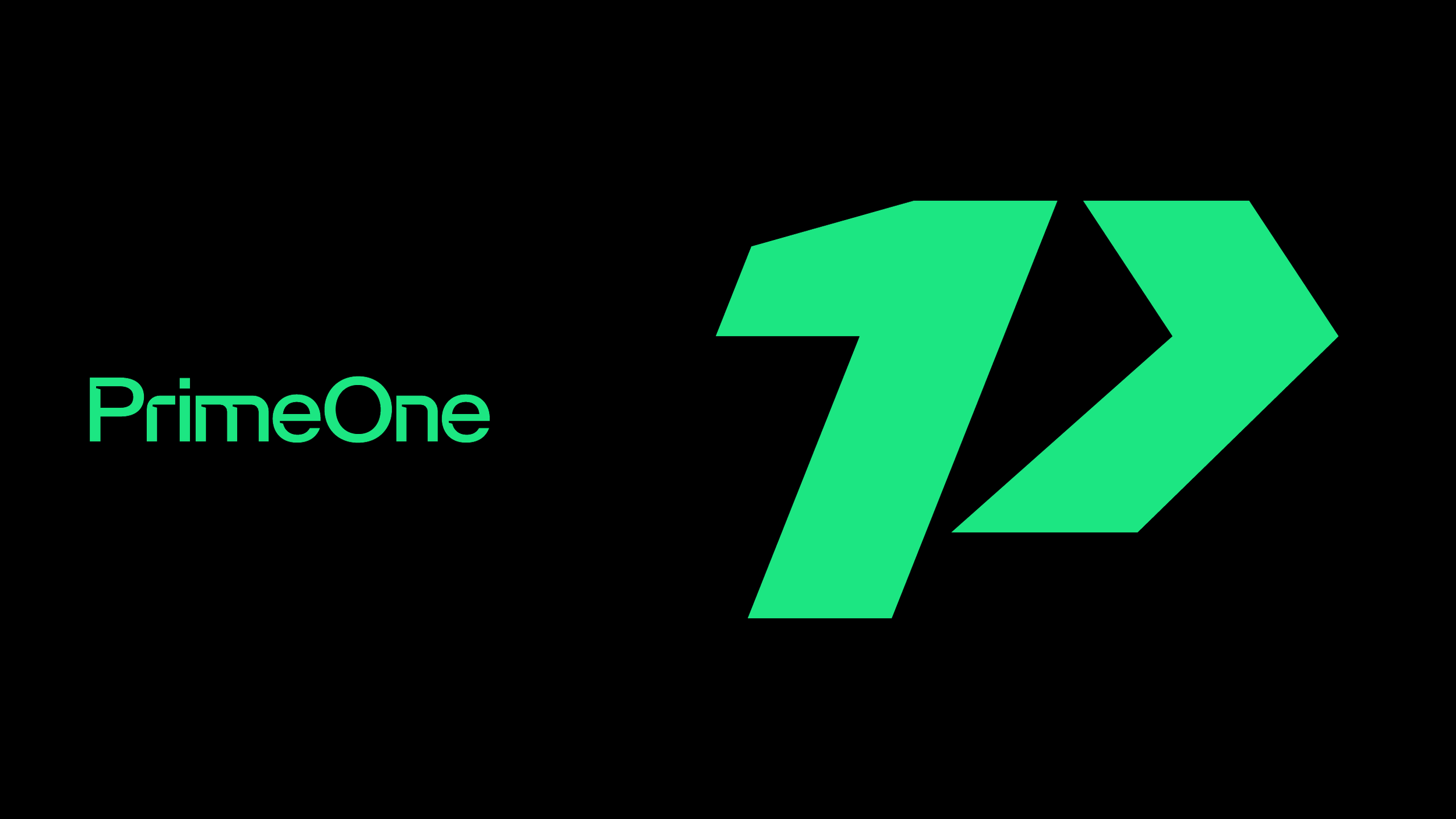
We built the identity around a distinctive wordmark and a compact, angular P symbol. Together, they give PrimeOne a recognizable signature that works across scales, from a business card to a service vehicle.
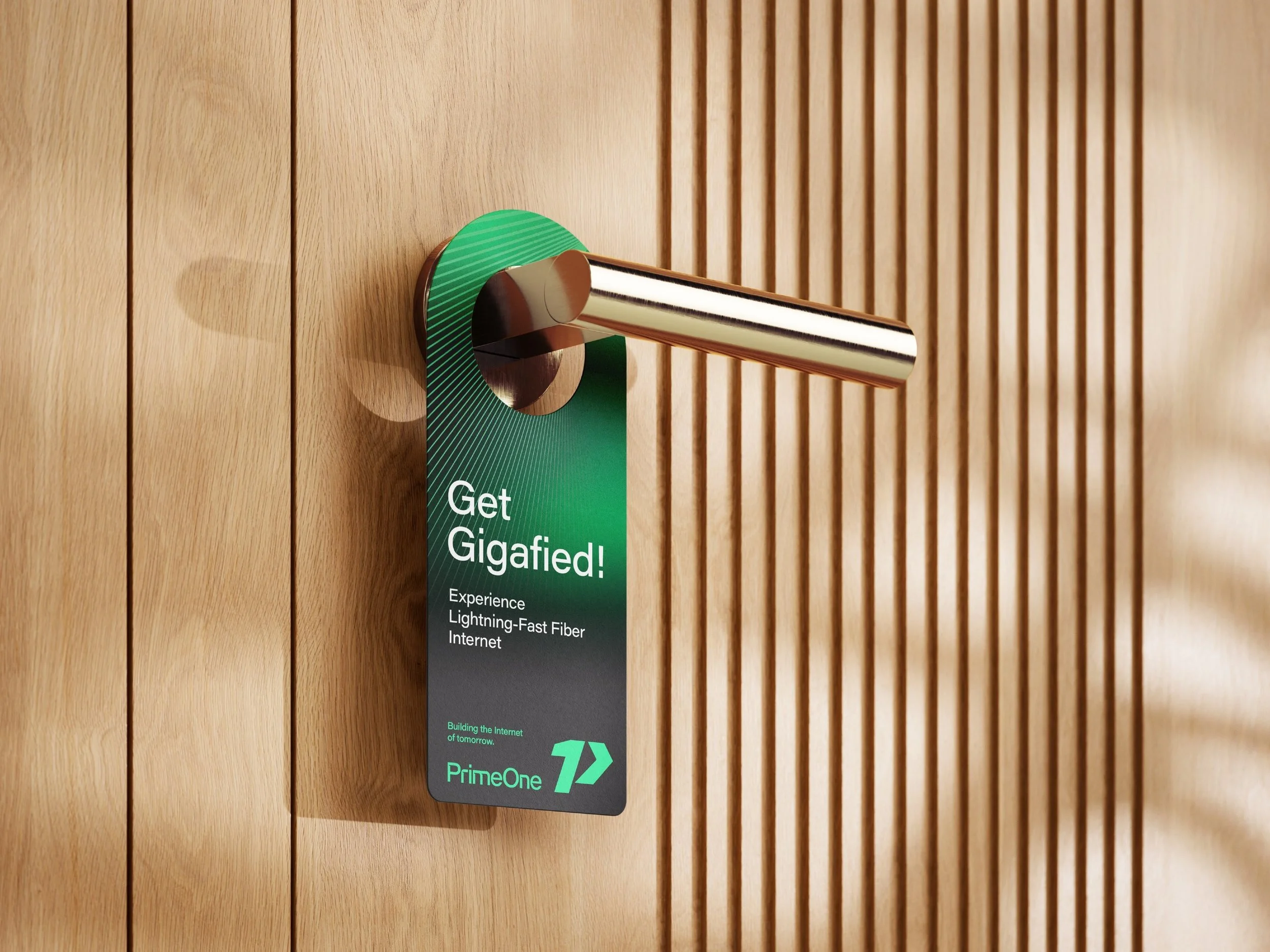
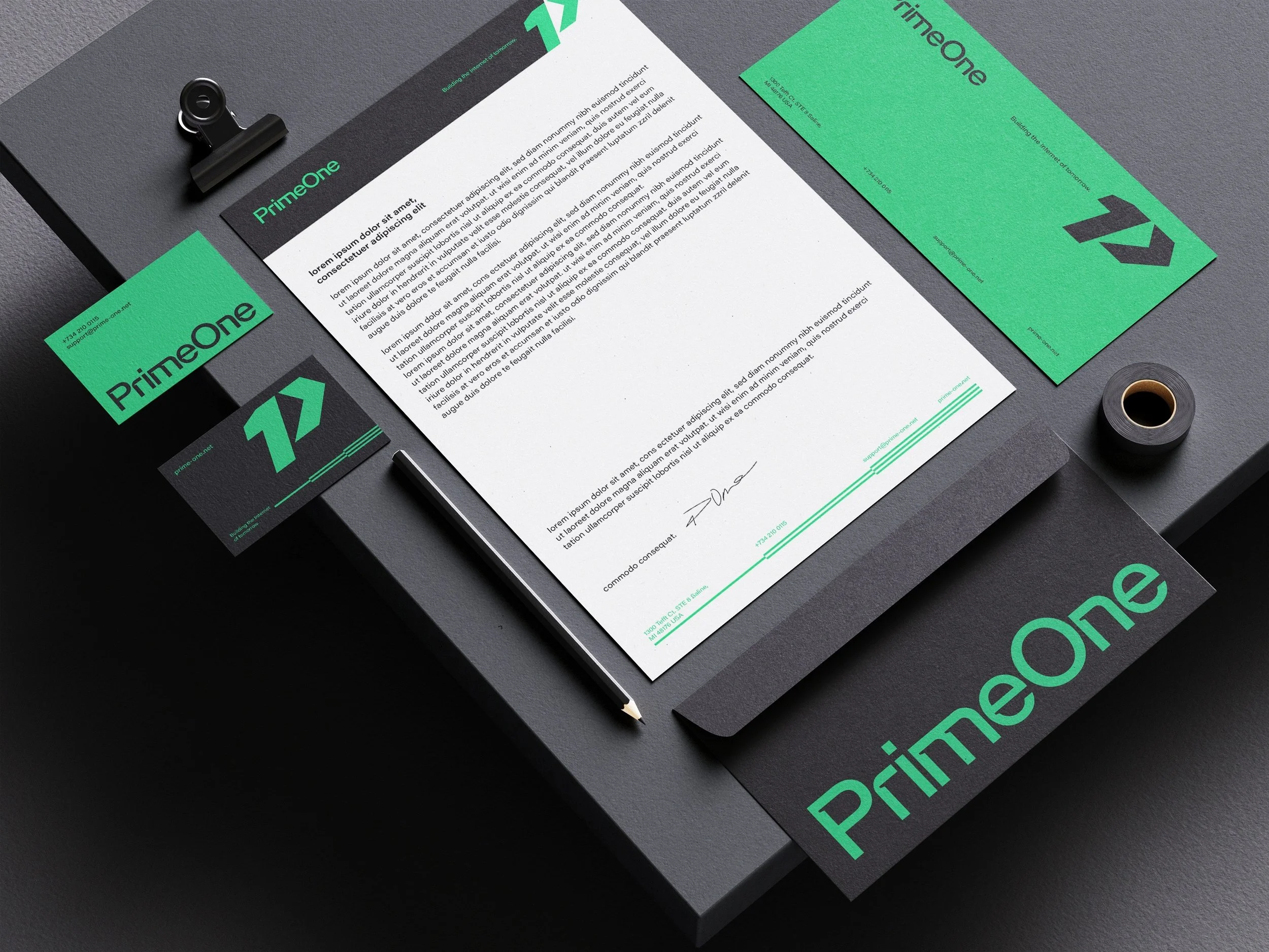
A focused green-and-black palette creates a strong visual presence. Precise typography, generous space and a graphic language of expanding lines bring consistency to the system, connecting the identity to the brand’s promise: “Building the Internet of tomorrow.”
Across vehicles, uniforms, printed materials and the website, the same visual discipline makes the company feel organized and ready to serve.
The aim was to give PrimeOne a credible foundation for growth: a brand customers can recognize, understand and feel confident choosing from day one.